Activate Inspiration by Sharla Jean Hoskin
December 19, 2017
Some artists develop an intuitive sense of color and others desire to dig deeply into theory to apply to their work. Thorough color study can span a diverse range of arts, sciences, and humanities. The exercises below have their roots in the 18th and 19th centuries, when art and science merged to study visual perception.
Easy to See Simultaneous Contrast
Simultaneous contrast occurs when two or more colors are viewed in the same visual field at the same time. The difference between the two colors becomes emphasized. This difference occurs in the visual system and is not a property of the color itself.
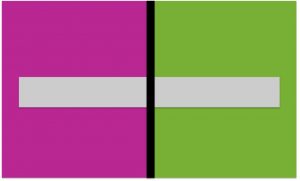
Figure 1: The gray bar changes color as it crosses the red violet and yellow green fields of color. It appears pinker on the green field and more yellow green on the red violet.
Exercise #1: Test the impact of a color change on another color.
- Use colored papers or painted backgrounds
- Apply a foreground color using acrylic paint or paper
- Describe what you see
- Can you create a design that uses this effect to add more color variation?
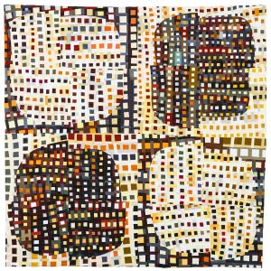
Figure 2: In Frameworks III by Julia Graziano the colors appear lighter on the darker background and darker on the lighter background shapes, increasing the number of colors appearing in the design.
The illusion is most apparent, if the amount of value contrast between the colors is small. The color with the largest area will influence the color of lesser area. The brighter, more pure color will impact the color that is more neutral. Grays and tans are particularly influenced.
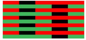
Figure 3: Even black can be manipulated to look red when positioned against green or look green when neighboring red, as discovered by Michel Eugene Chevreul, director of dyeing at the Gobelins tapestry works in Paris. His extensive research was published in The Principles of Harmony and the Contrast of Colors in 1839.

Figure 4: The Fluting Illusion is a form of simultaneous contrast. On one side of each gray shape the edge is compared to a lighter value and on the other edge the gray is compared to a darker value. The lighter neighbor makes the gray look darker. The darker neighbor makes the gray look lighter. The visual effect is that the gray appears to change from side to side creating the illusion of architectural fluting.
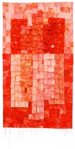
Figure 5: A similar play of values is visible in Orange Towers by quilt artist Eti David, who created a challenge to work with one hue and one fabric.
The Impact of After Image
The study of visual illusions that impact color evaluation also includes Successive Contrast or After Image. Successive Contrast means viewing the stimulus color and the impacted color sequentially. The appearance of a color can be changed because of another color viewed previously.
Focusing on a color produces the sensation of the complementary hue once the original stimulus is removed. The after image:
- Appears after the original image
- Is the complement of the original color
- Is less intense than the original
- Drifts and moves with eye movement
- Can be seen in the absence of light, such as closing your eyes.
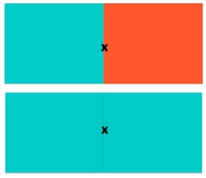
Figure 6: The after image of a pair of complements is visible here. First focus on the pair at the top then move your focus to an original hue below. The red orange after image of blue green results in a duller effect on the left, whereas the after image of red orange on blue green results in a “double dose” of blue green and an increase in intensity.
Exercise #2: Try the same experiment with a different pair of complements. Can you create a design that uses this effect to add more color variation?
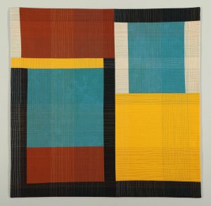
Figure 7: In Corners of my Mind 2 by quilt artist Barbara Nepom successive contrast makes the strength of the yellow creates a blue after image and makes the blue green appear bluer and the orange appear more neutral.
Seeing is Believing with Visual Mixture
Post Impressionist paintings introduced a sensation of light using small areas of color that mix together when viewed.
Exercise #3: As the Impressionists you can create the same illusion of light using visual mixture.
- Find or create large squares of color. Additive complementary colors work very well
- Cut paper into strips
- Weave strips of color together
- Compare of difference of the colors woven together with the large areas of the colors. What do you see?
- Compare of difference of the colors woven together on different background fields. What do you see?
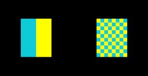
Figure 8: Small squares of reflected light mix in perception to give a light grayish/white color. When mixing these colors in pigments, light would be subtracted and the mixed color is darker.
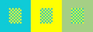
Figure 9: See how the surround color completely changes the impression of the same center grid. This shows combination of the effects of optical mixing and simultaneous contrast to manipulate the visual result.
Exercise #4: Try this with a small printed pattern or when framing your artwork.
Visual Balance using Spinning Colors
Optical mixing can also be achieved using spinning color. This was a technique to study visual perception of color and color mixing in the 19th and 20th centuries.
Exercise #5: Do you need another color for your palette?
- Spinner toys from a novelty or dollar store work very well for this color mixing experiment. Please avoid the style that has been recalled containing lead.
- Try the technique:
- Find colored paper or use colored pencils, markers or paint to create a design using the colors in your palette
- Cut a circle slightly larger than the spinner
- Make a hole in the center that will fit over the spinner
- Lighting conditions and speed of the spin will influence results
- Give it a whirl
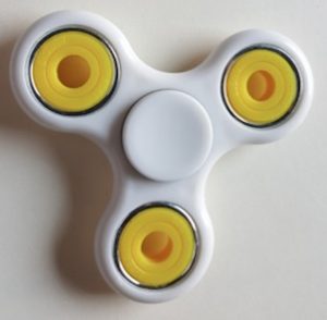
Figure 10: A spinner
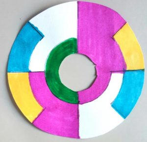
Figure 11: White, yellow, magenta, cyan, and green are the palette used here. What new colors are here? Since the results are a mix of the palette colors, it will be harmonious and balanced.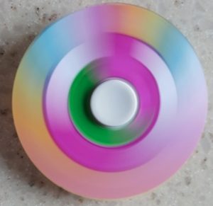
By exploring color theory and artistic application, I hope you have enjoyed these simple exercises and generated some new ideas.
-Sharla Jean Hoskin
To read more about color theory and quilting, check out Sharla’s article “Following the Creative Path of Color Theory” from our Fall 2017 edition of Surface Design Journal “Color” (pages 18-25).
Related Blog Articles
No related blog articles yet.